
The Pillars Hotel has a beautiful website found here, though I might be biased since I helped to design it. When the owner and I sat down this past summer to discuss the website’s layout and key details, a lot of our inspiration came from competitors website, whether good or bad. The two closest competitors to the company, both physically and in terms of target audience, are the W and the Ritz-Carlton.
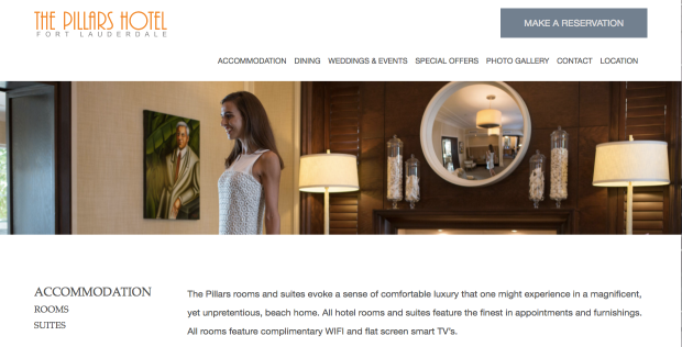
The Pillars is known for its elegance and the pretty orange typeface that serves as the logo. The whole website has a simple white background that connects the entire thing together to provide continuity. The updated pictures that scroll across the home page and are under each of the headers of the subsequent pages. The website converts over to mobile beautifully, and it doesn’t impede the use of any of its functions.


On the website The Pillars offers special deals that incentivizes its users to book directly through the hotel rather than through TripAdvisor or some other similar booking agent. The Facebook and Instagram direct users to the website, and the website has social buttons that link to the respective websites. These buttons are small however, and you have to scroll all the way to the bottom of the page to find them. I would personally recommend moving these up to a more prominent or noticeable position on the page.
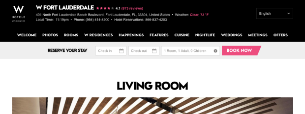
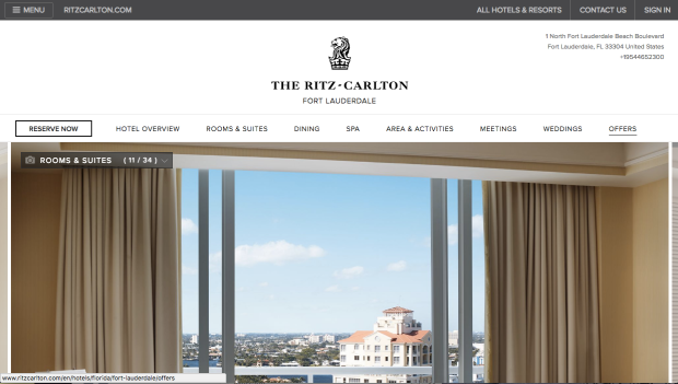
Furthermore, in comparison to the W, our website is far more clean and appealing to the eye. The W is dark and highlighted with neon pink which has an abrasive feeling. The Ritz however is soft and subtle, which is more inviting and makes you want to further explore the page.
As far as content goes, all websites are pretty evenly ranked. Where one falls short, they all fall short, but in most places they all succeed with flying colors. None of them offer a search bar for their websites, but each has clear easily distinguishable headers that really removes the need for that kind of feature. They all put the reservation access clearly highlighted on the front page and it continues to be highlighted on all subsequent pages.
